
Britannica Reimagined
Rebranding
Student/Passion Project
Overview
Digital redesign of Britannica
My Role
Research, UX/UI of app and select site screens
Team Members:
Hira Ali and Ashley Aviles
Problem
The current Encyclopedia Britannica is used for educational purposes. However it is never the first option used to conduct research and aid with learning. How do we update Britannica to the modern age?
Goal for project
Update Britannica, and make the site friendly and interactive to its users.
My Process

Research
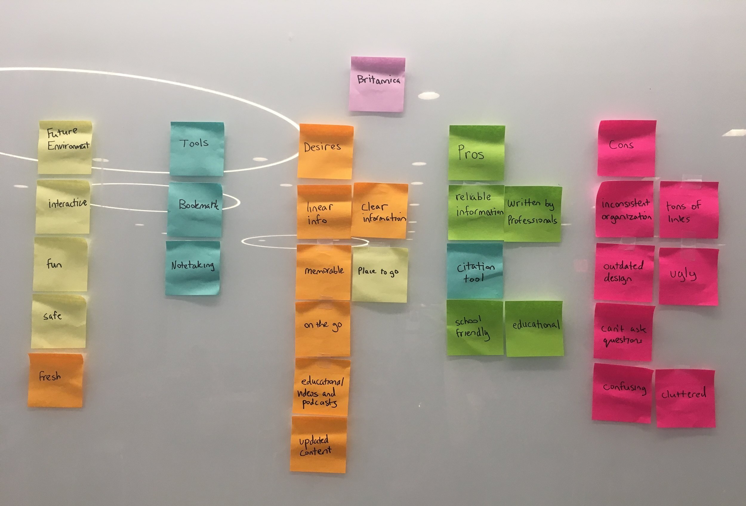
Affinity Mapping
Pros - The site is known for its reliable information with articles written by scientists and professors. It is also school friendly.
Cons - The current site has a lack of organization as well as an outdated design. This indirectly makes the articles and information look outdated as well.
Desires - Britannica will be the site to go to, and will be a memorable experience with clear information, and educational experiences.
Future - The new Britannica will have a fresh and interactive take on learning.
Tools - Currently Britannica only has a citation tool. There should be a more interactive way to experience and learn.
Ideation
After our research we came up with different possibilities of how we could make Britannica a place you would want to go to. We wanted to target inquisitive minds, but also ones who would like to learn but don’t have time. After making a list of 20 ideas we summed it down to 2 ideas.
Website that is personalized to the user’s educational needs
A mobile app where user’s can listen to podcasts or read articles on their morning commute.
Solution
Create an environment (Site & App) that is personalized to the user’s educational preferences. A place where people can interact with content and are excited to learn.
Insight Statement
We love learning new things and have a passion for questioning ideas. However, most websites don’t hold our attention for too long. We wish there was an exciting, one-stop learning destination that challenged our minds.
Personas

Stephanie Tully, 26. NY
Young Urban Professional
“As an office-worker, I’m bound to my desk from dusk till dawn. This sucks because I have little time to dedicate to my interests or personal growth, which are important things.”
Needs
- To stay updated all the time
- Time to pursue intellectual interests
Goals
- Learn something new everyday
- Explore a new hobby
- Be an inspiring older sister

Kenneth Lane, 21. Boston
College Student
“As a psych major I enjoy learning about other people. It’s partly why I question everything and find joy in analyzing anything. Because of this, I realized that there’s so much I still don’t know.”
Needs
- Unbiased general information
- A healthier meal plan
Goals
- Become a psychologist
- Graduate with honors
- Successful Youtube channel
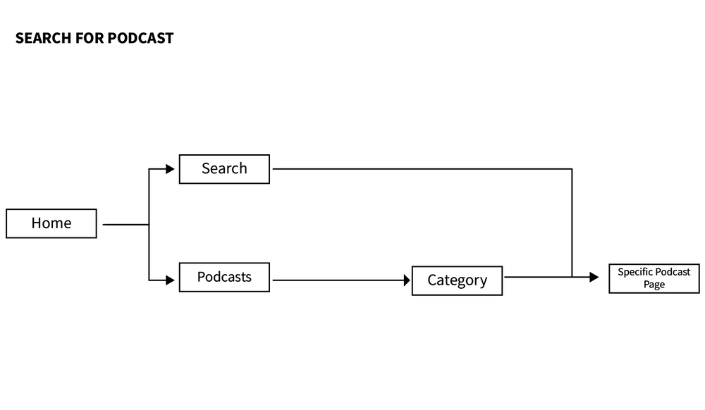
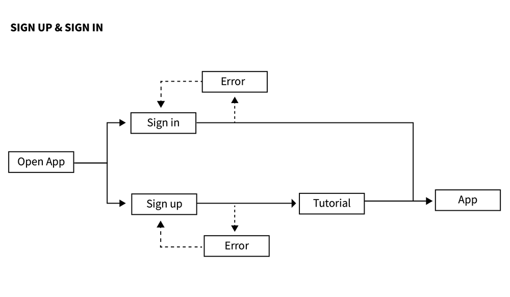
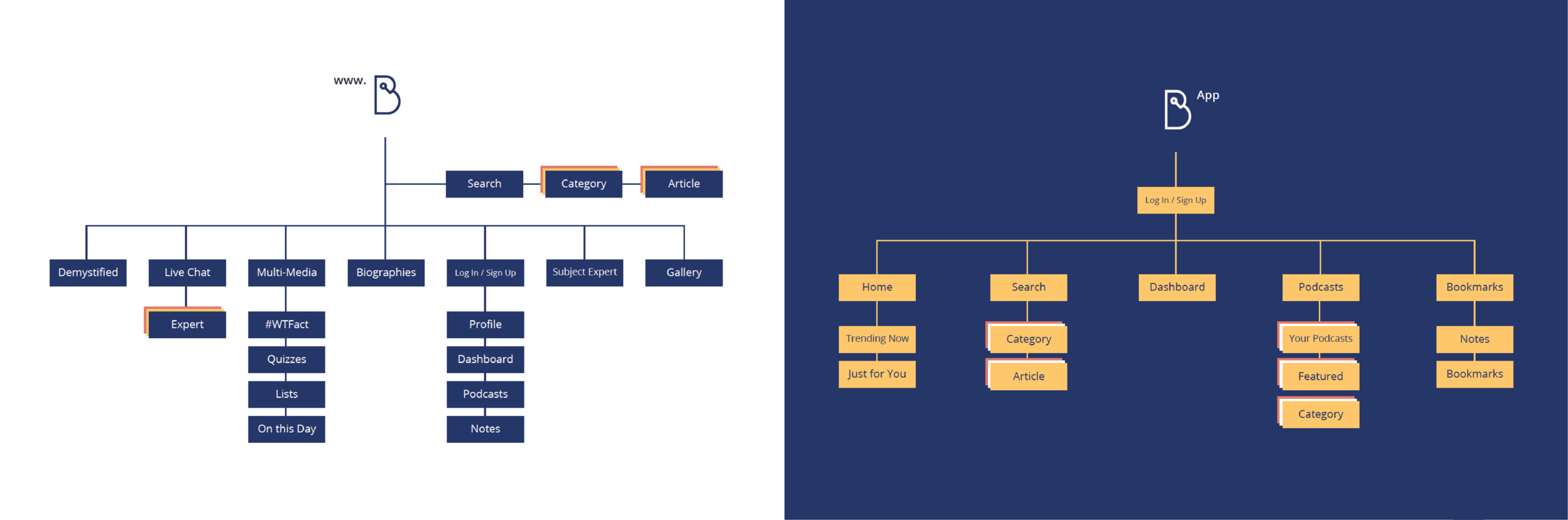
User Flows
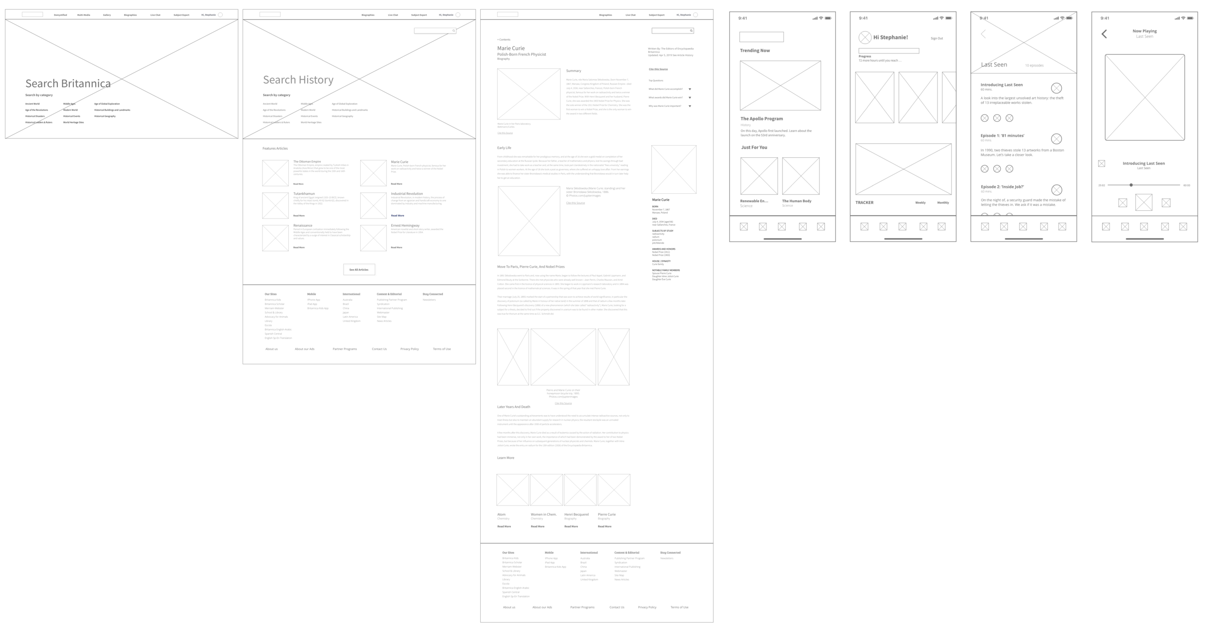
Wireframes
Maps
Branding
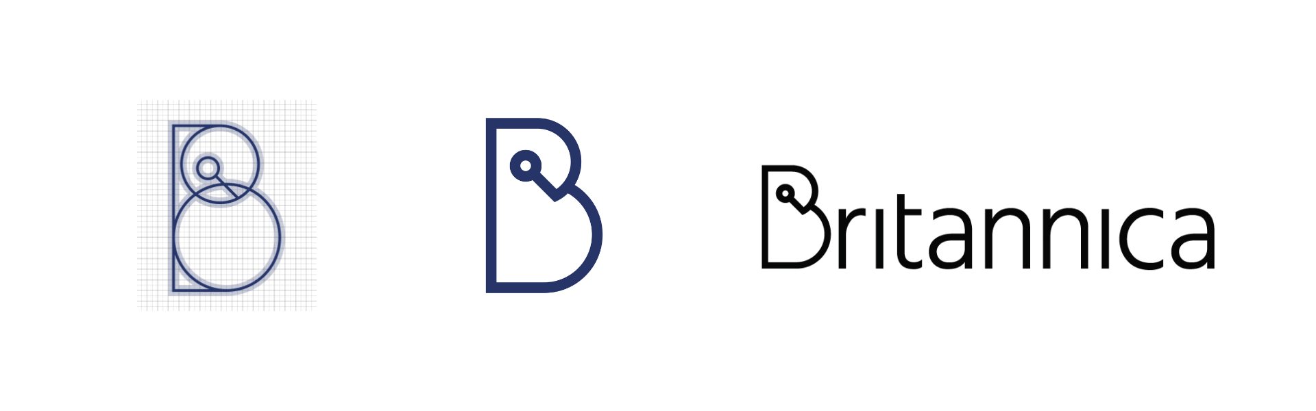
Concept
The logo treatment was inspired by the encyclopædia’s traditional learning symbols—the owl and magnifying glass. To make it unique to Britannica, the owl takes the shape of the capital “B”. Because there was such a drastic shift from print to digital, the logo further serves a clean look.
Color Palette & Typefaces
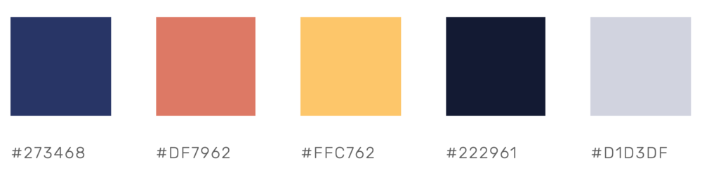
Bree Serif
Open Sans Regular & Light
Visual Design - Site
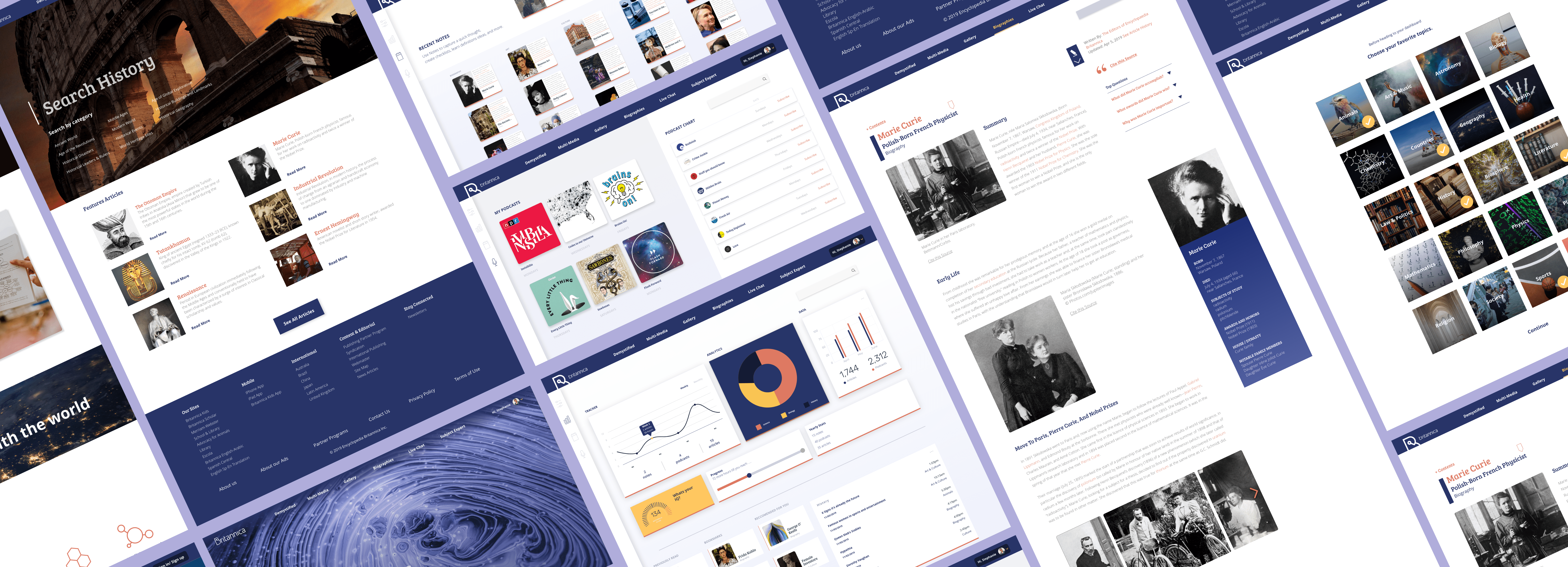
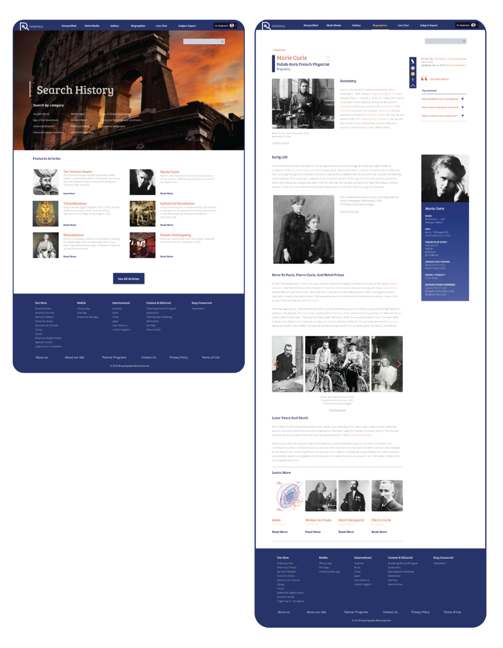
The New Britannica
The new site is more interactive and playful with the user. Experiences include, a note-taking tool kit, customization features and a dashboard where users can keep track of their notes and learning.
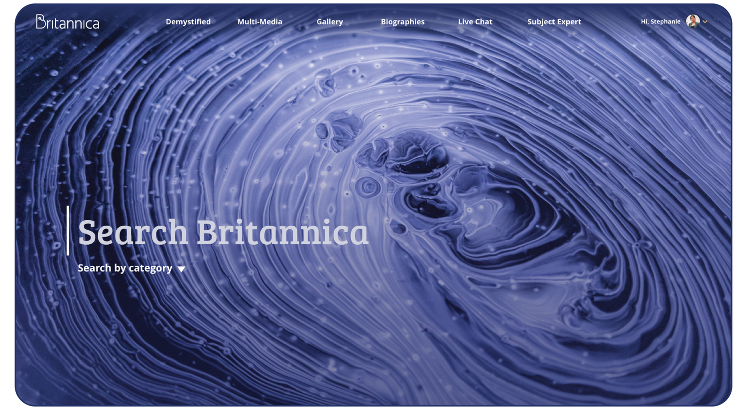
Home Page
The home page contains visuals which change from time to time.
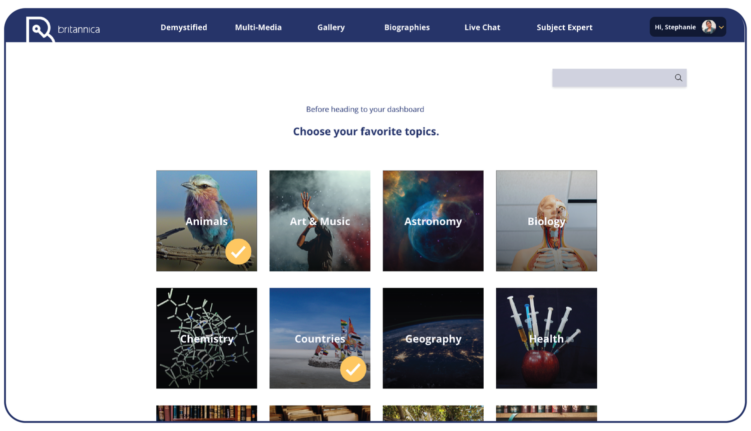
Customization
Through the sign-in process, users will be prompted to choose a variety of their favorite subjects. Britannica will create a feed of recommended articles, quizzes, biographies, and podcasts based on the user’s preferences.
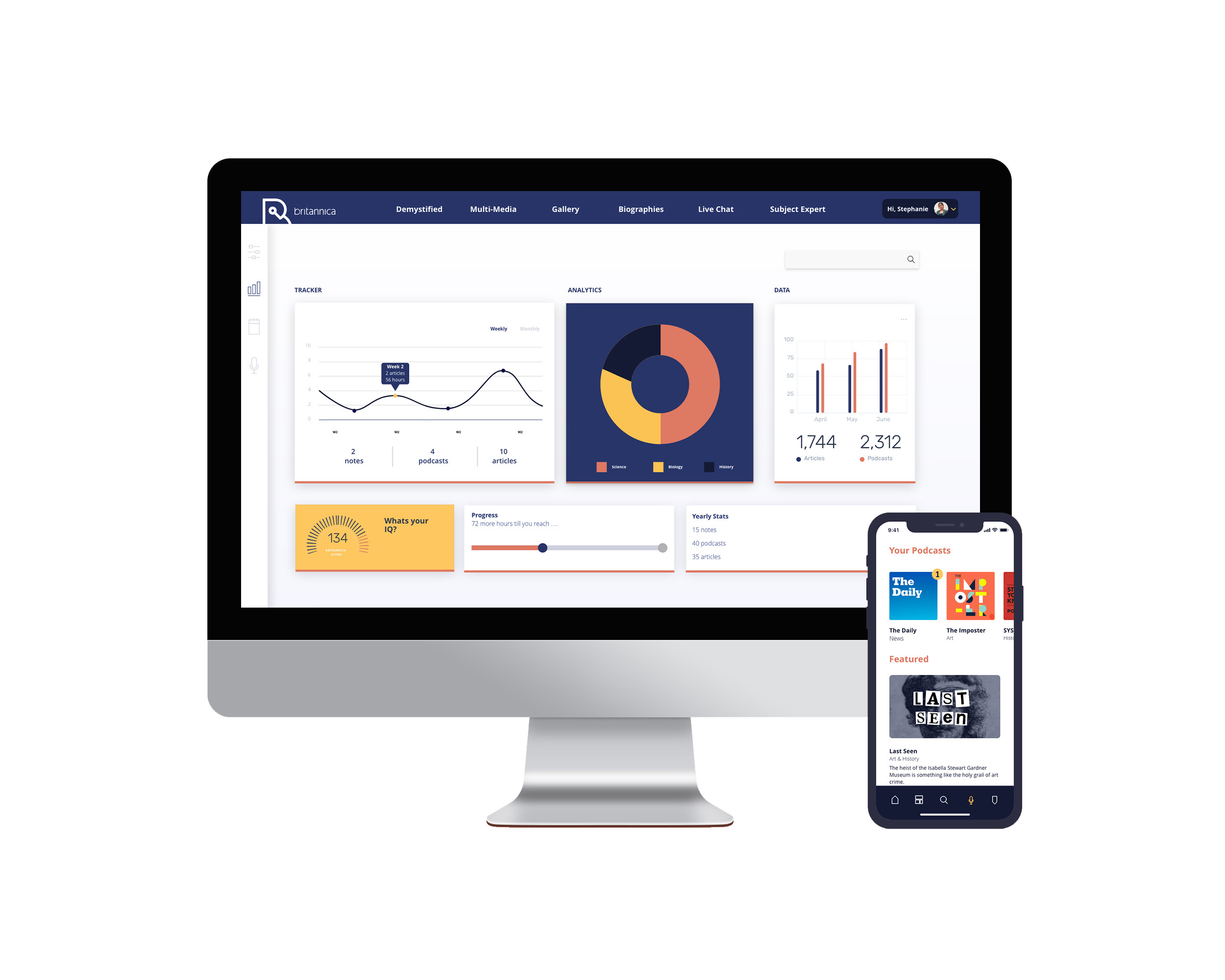
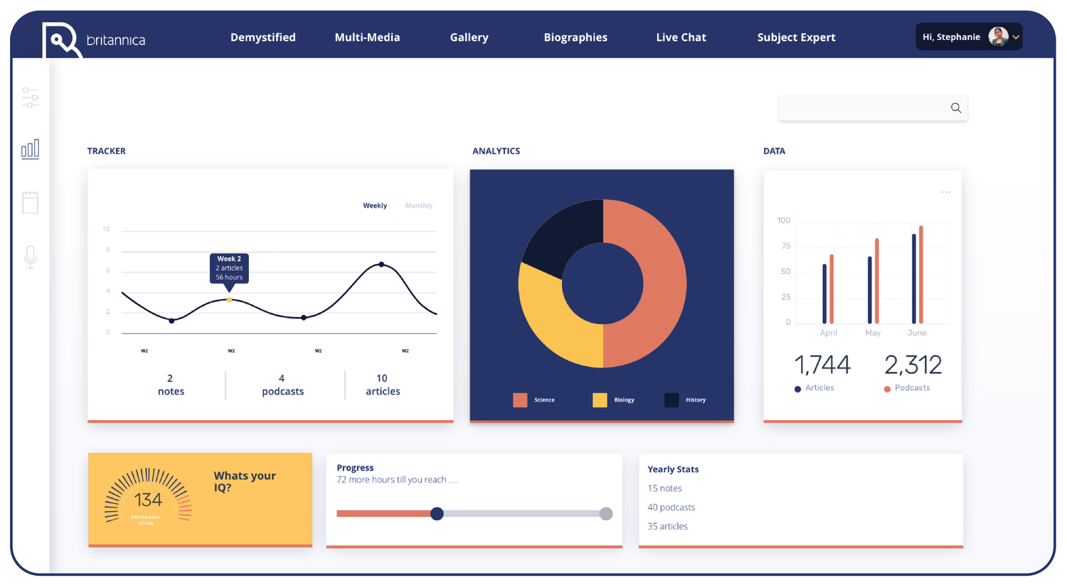
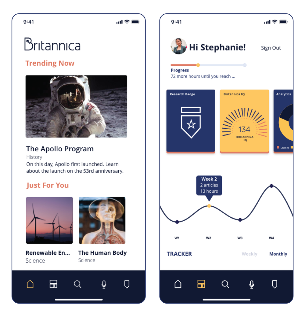
The Dashboard
The dashboard allows users to monitor their learning. Analytics and data keeps track of the hours spent on reading and listening.
Tables and graphs are organized by week or month.
Notes & Podcasts
Users can access the notes they have created, read articles, as well as tune into podcasts to which they have subscribed.
Category & Article Pages
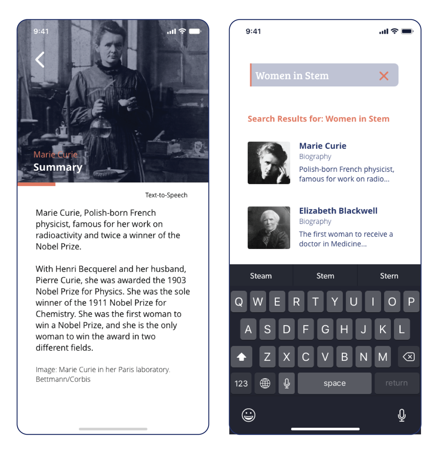
The new article pages include a note-taking kit which learners can use to highlight, write notes, look up definitions and cite sources.
Visual Design - App
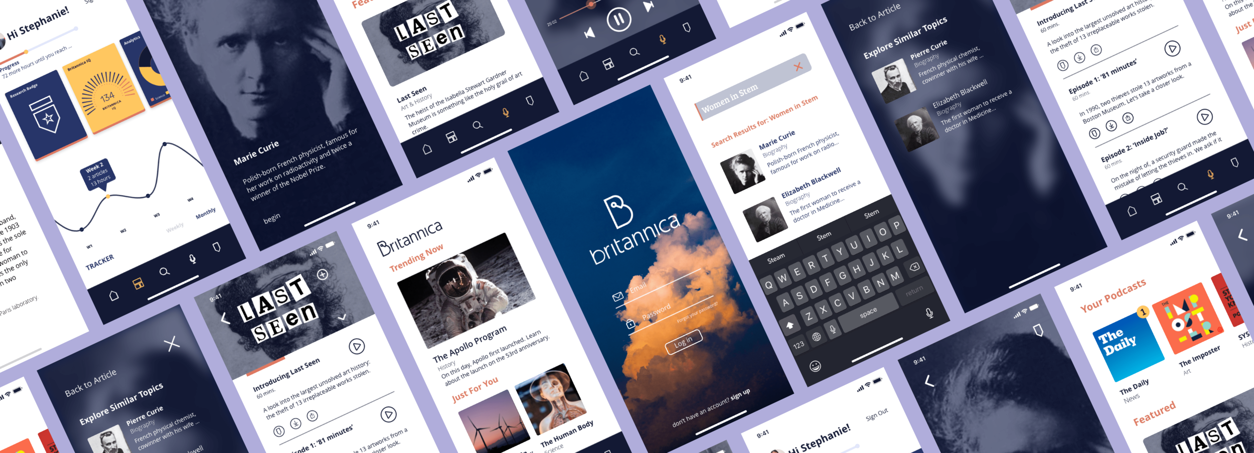
Britannica App
The Britannica app is for our “on the go” lifestyle users, who want to learn but time is of essence. They can read articles or listen to podcasts on their commute through the mobile app.
Personalized Content
The home screen on the app generates articles specifically for the user, while the dashboard within the app shows a simplified version of the desktop.
Article Layout
What I Learned:
1. Organizing and understanding content
The old Britannica site is very content heavy and overwhelming. As a UX designer I had to break down and organize the information so I could understand the site. I had to figure out Britannica’s pros and cons so I could help make the site better when redesigning it.
2. “Plan before doing” and the importance of user flows.
Our new Britannica site/app is very user driven. From signing in and choosing subject preferences on the site, to choosing a podcast on the app; it all revolves around the user and their choices. It was really important to visualize and write out the experiences before going onto Sketch. I learned a lot about user flows and the importance of creating them, and now I always write them out before I start wireframes.